
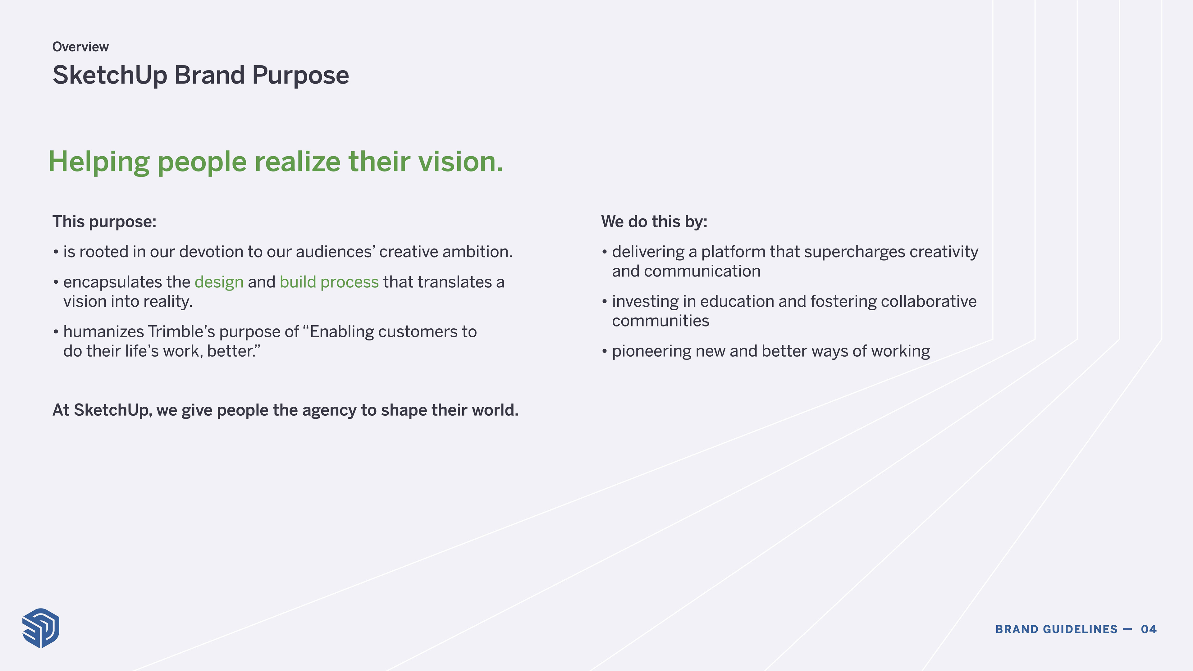
The end-result of strategy work to reposition SketchUp in the marketplace, which created a guiding light for product & marketing developments.


A focused look at our core-personas, helping identify the audiences that we needed to better tailor our marketing to.
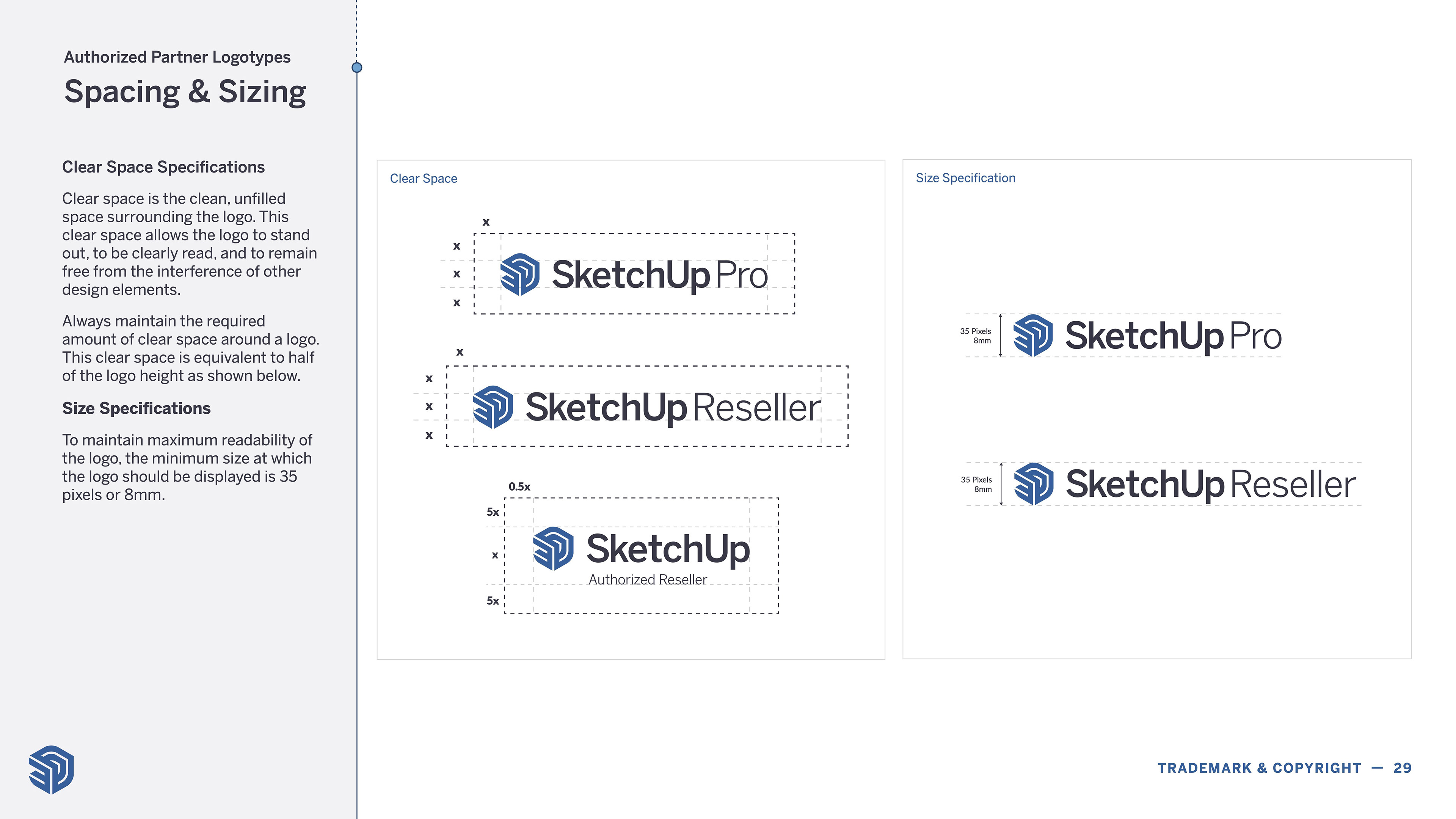
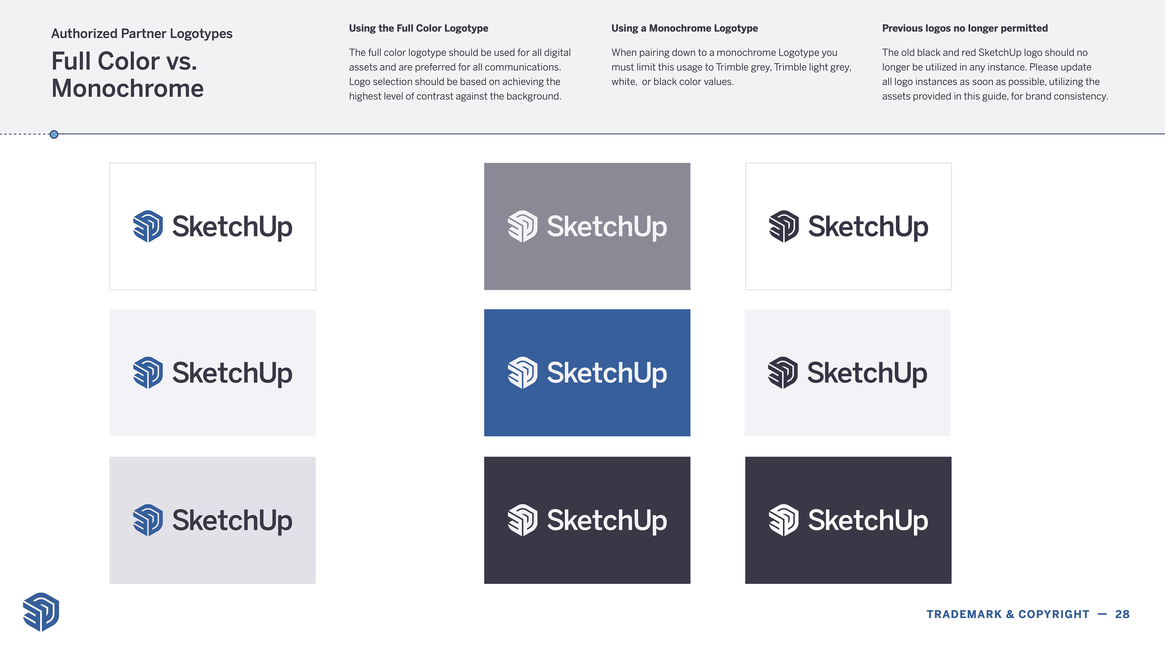
Logo usage & free-space guidelines
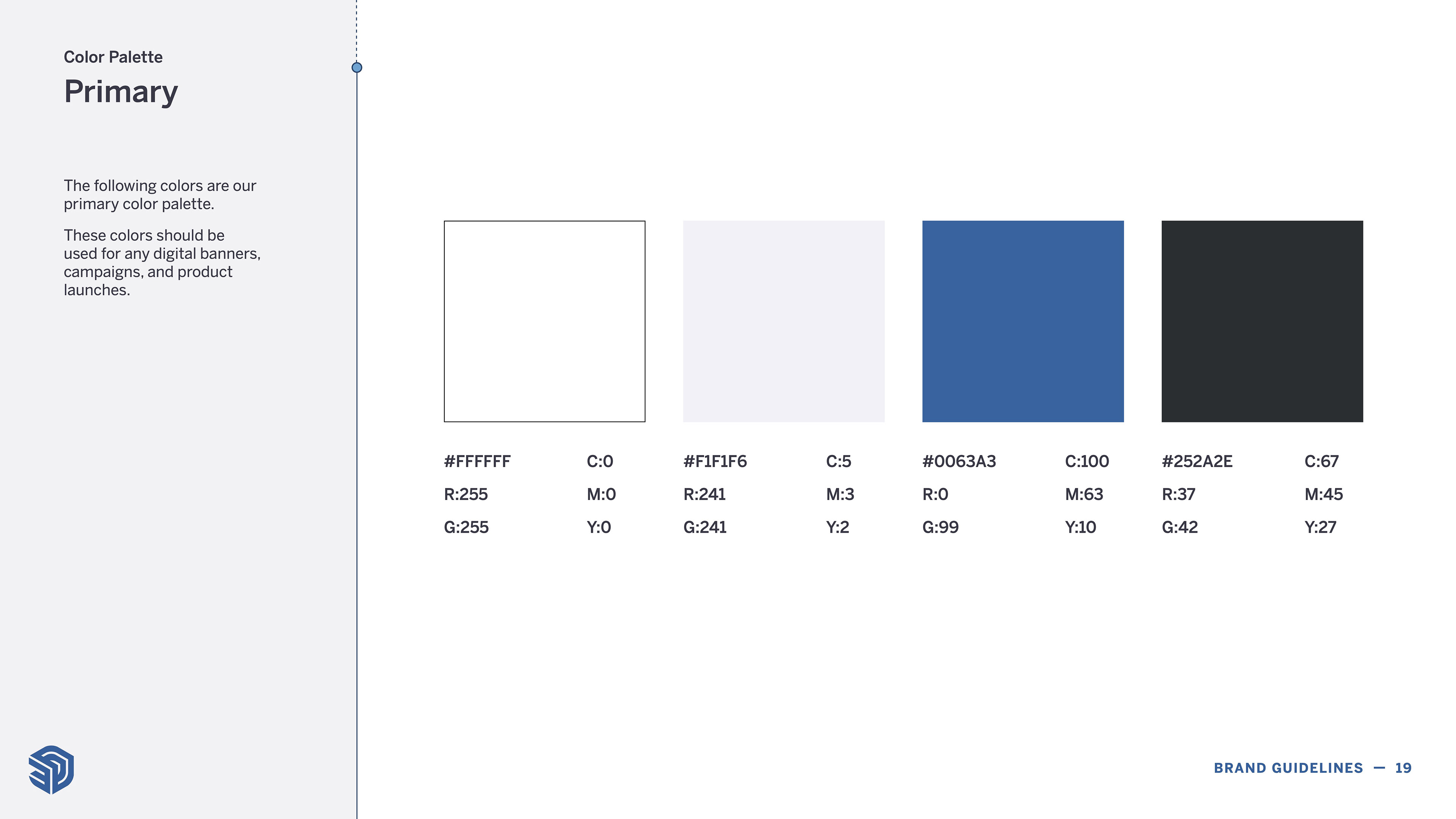
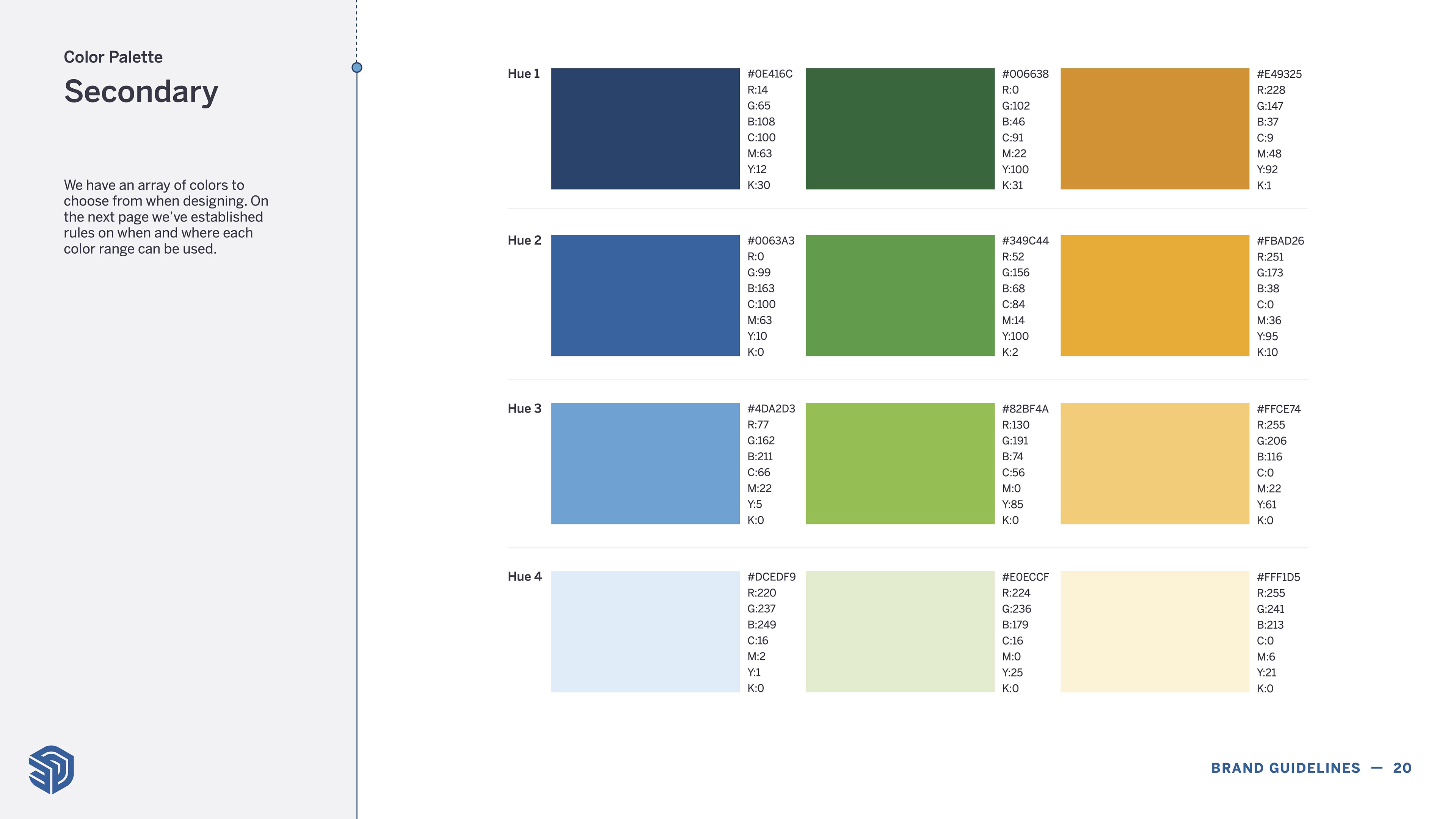
A expanded color palette of bright, happy colors.

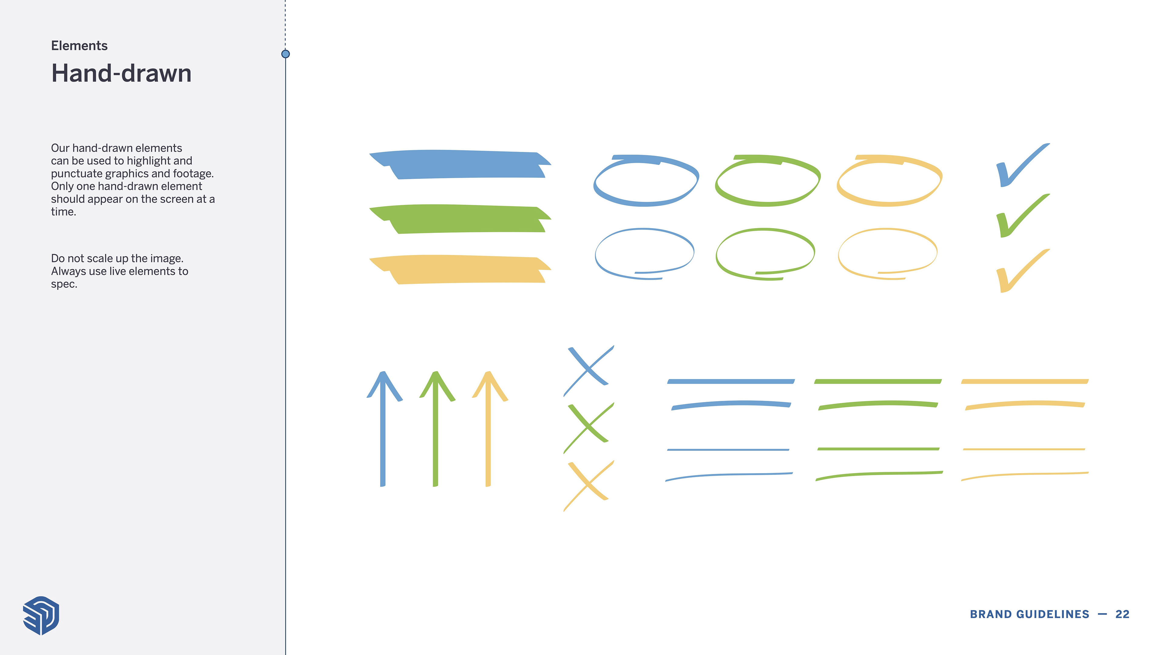
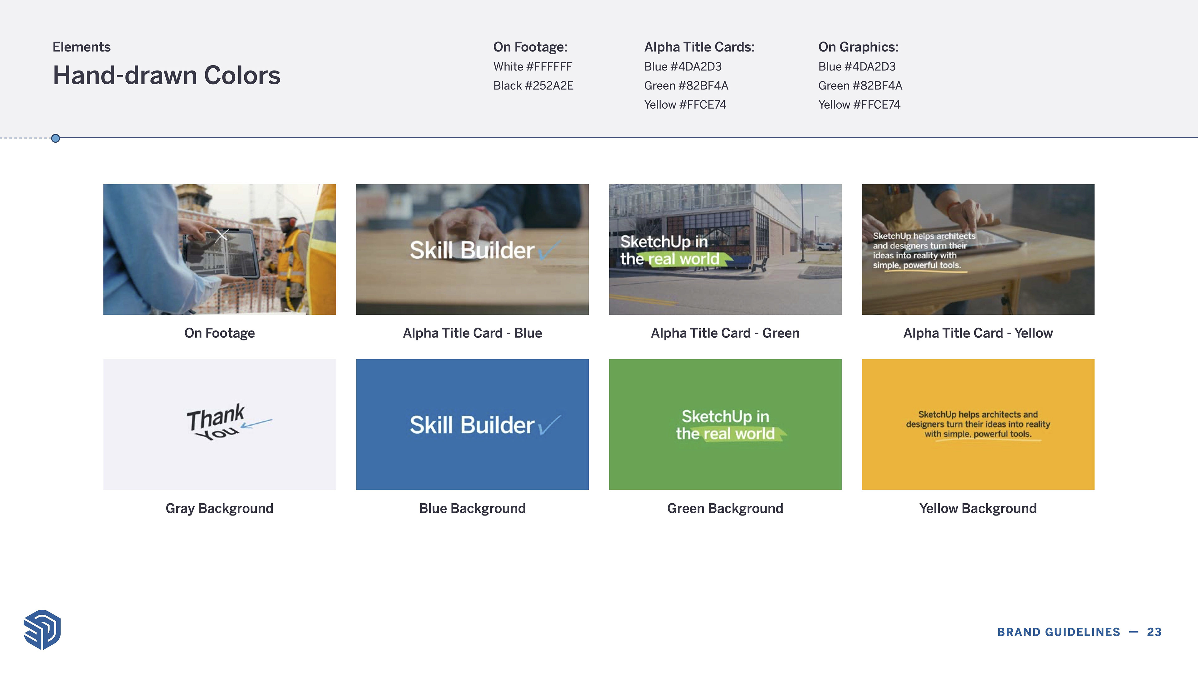
The inclusion of hand-drawn elements
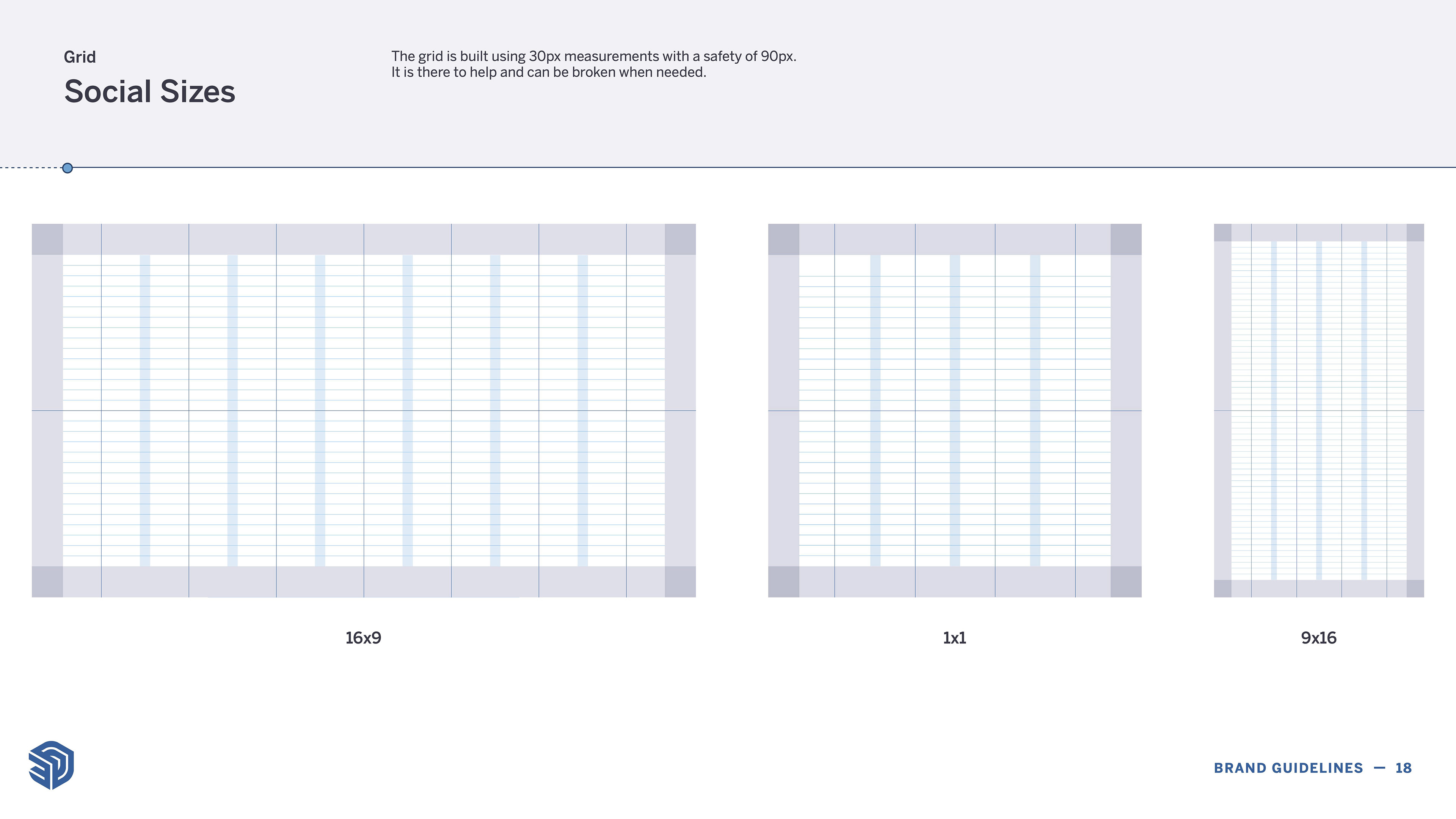
Alignment grids to make sure things non-designers within SketchUp could create materials that always looked professional
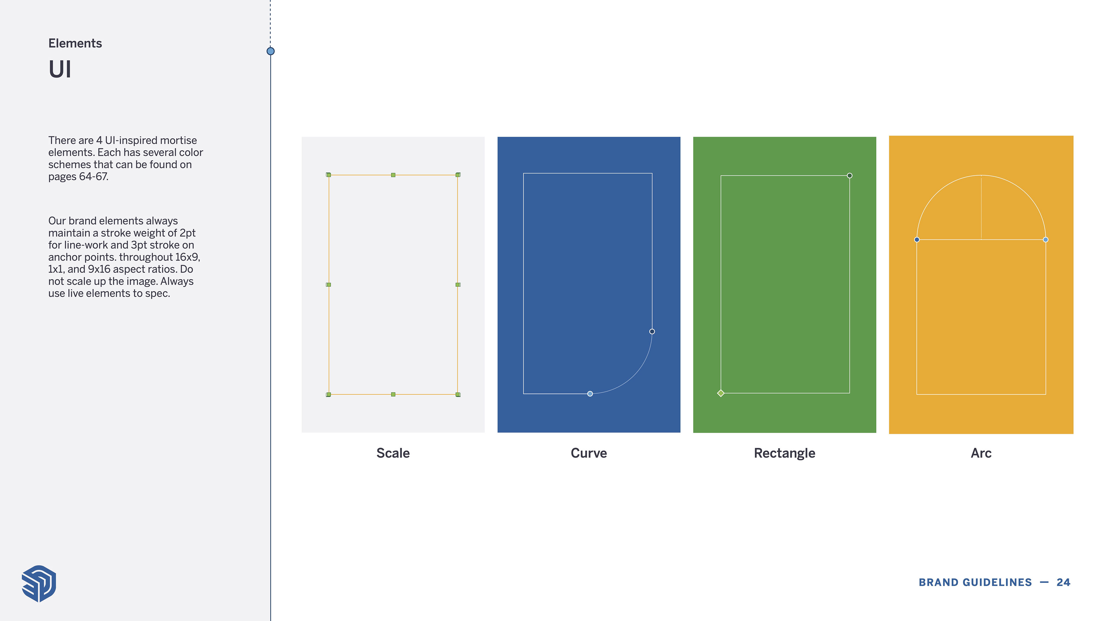
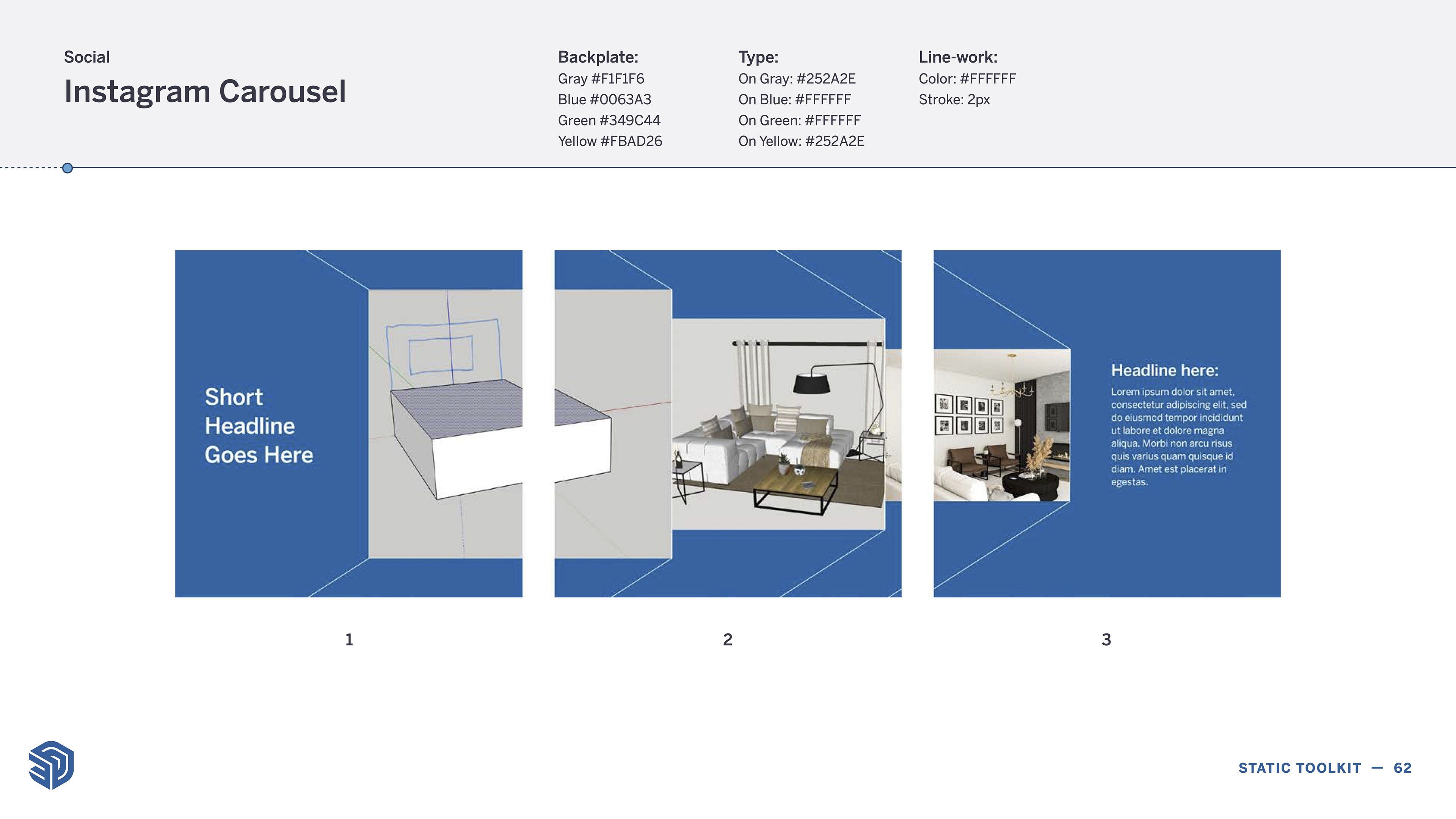
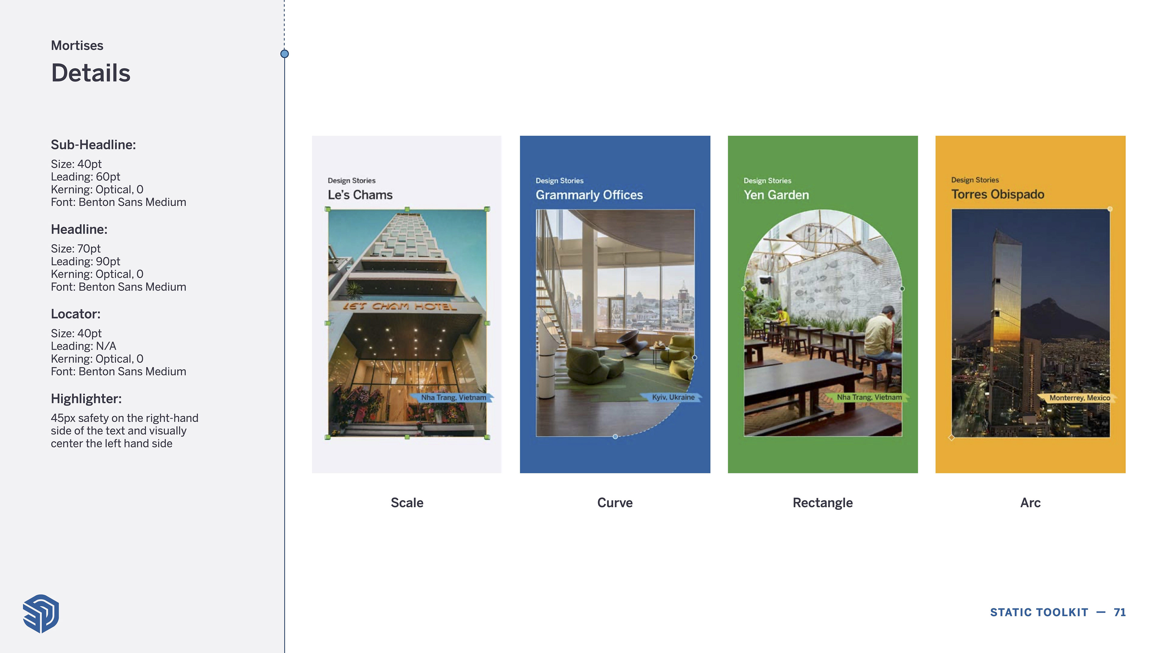
We incorporated elements from product UI to create imagery & text frames. These allowed our marketing to transition away from predominantly full-bleed imagery, allowing us to present designs in a new light.
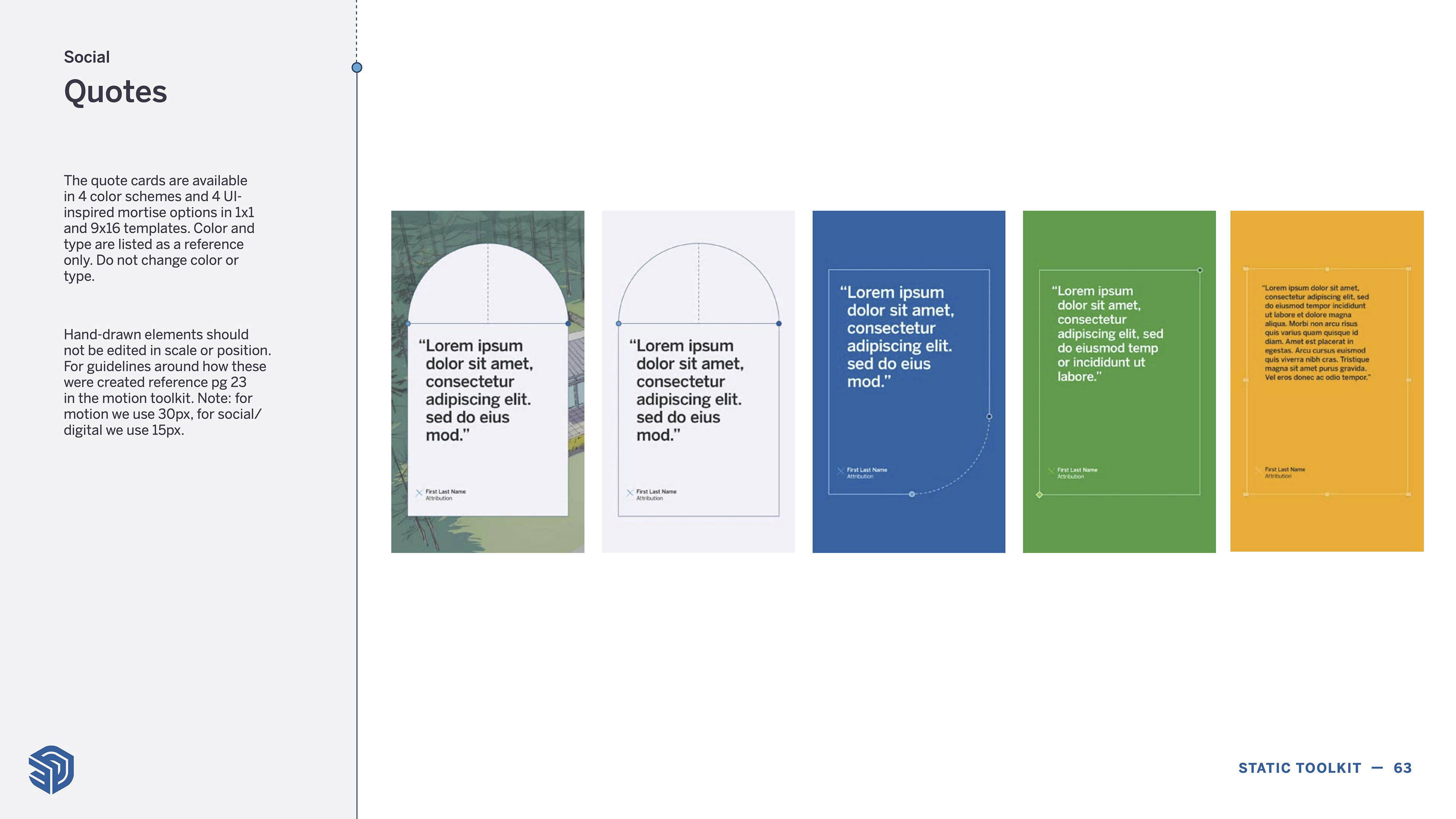
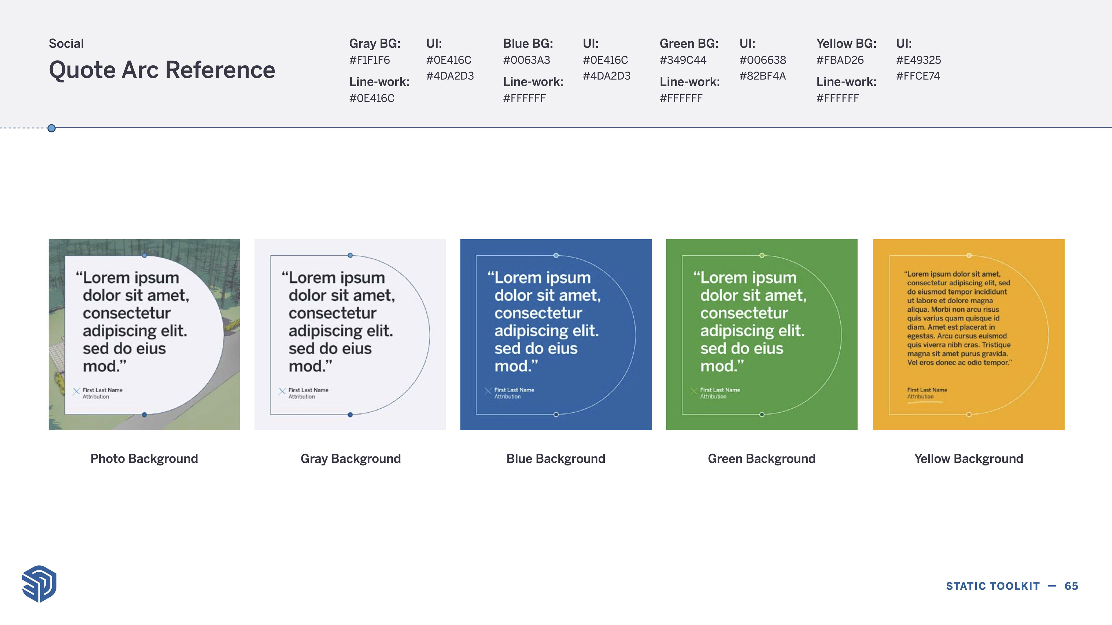

Visual guidance to be used by SketchUp's social media team.